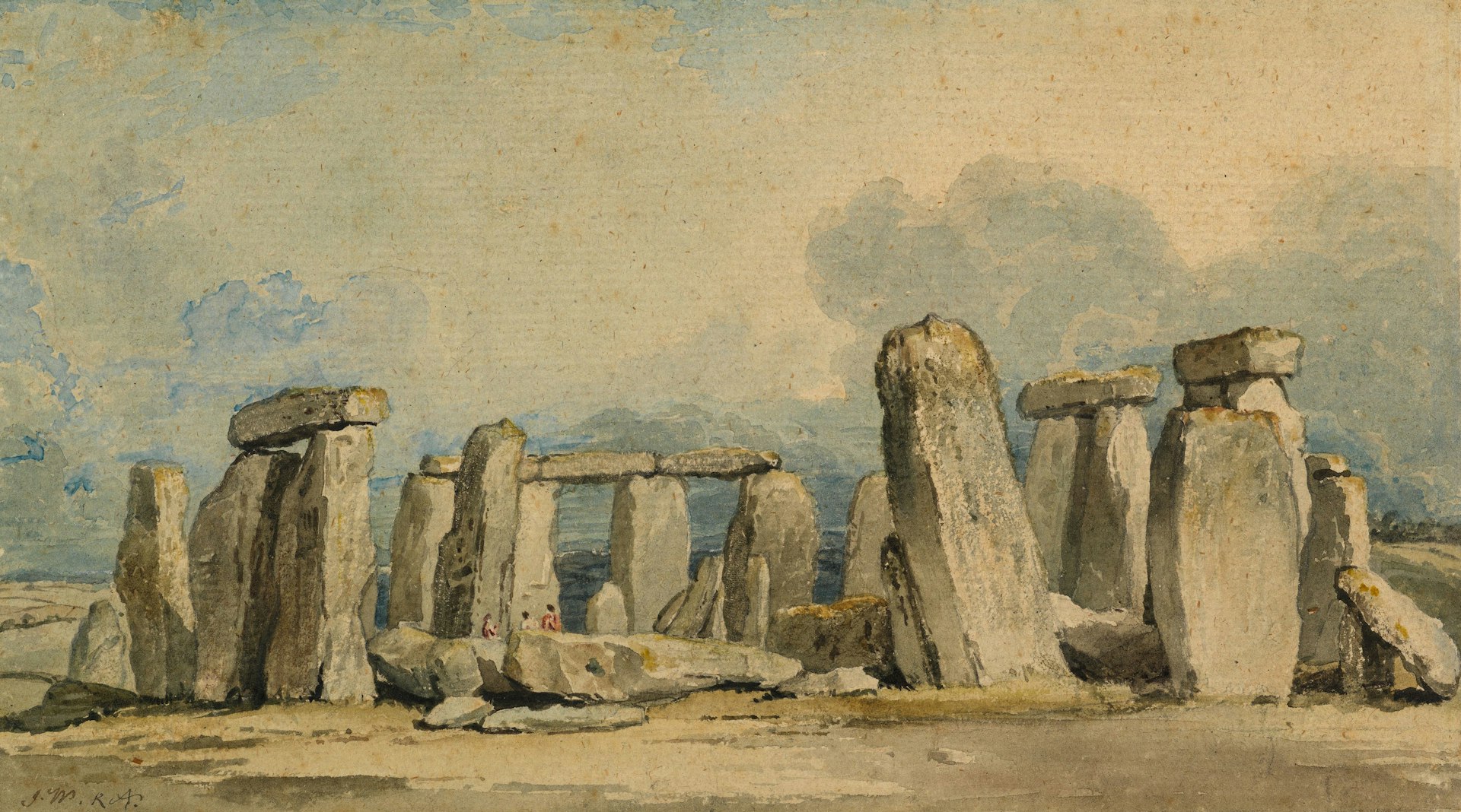
Continuing last week’s study on inking techniques, we’ll focus on using line weight to add dimension and emphasis to drawings. Our cover art demonstrates the simple technique of using bolder edges for those closer or for important border lines while lighter line weights serve to illustrate objects farther away or within a structure.
Why Line Weight Matters
Line weight variation helps convey depth, texture, and focus. Thicker lines can suggest objects in the foreground, while thinner lines indicate distance or subtle details.
Techniques to Try
- Pressure Control – Use a brush pen or digital pressure sensitivity to create thick-to-thin strokes effortlessly.
- Foreground vs. Background – Make foreground elements bolder and background elements lighter to create depth.
- Emphasizing Focal Points – Bold outlines can make a character or object stand out in a busy scene.
Exercise
Redraw an old sketch using intentional line weight variation. Compare it to the original and note the visual improvement.